


Web form submission rate analysis. How often do you look at your campaign results, really look at them? Do you spend time analysing the top line data and actually do something about them?
Do you split test campaigns? Do you measure more than one data point in your campaign?
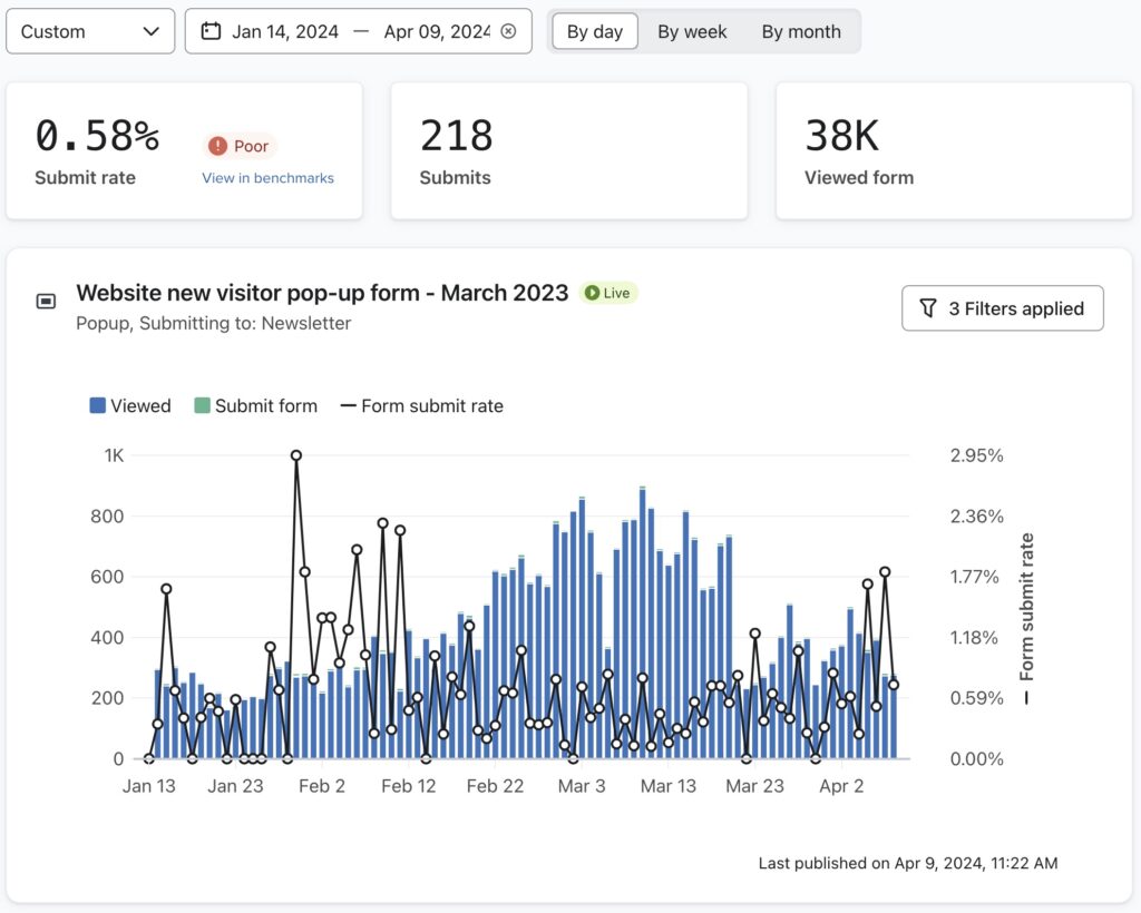
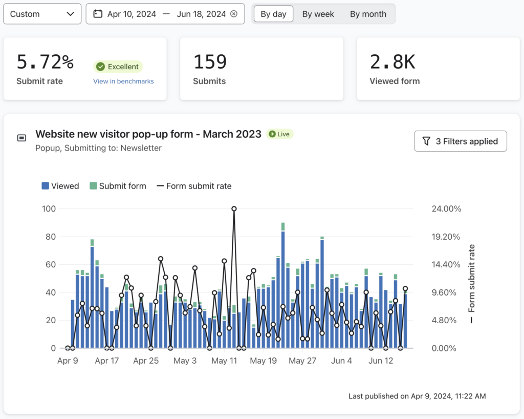
These two charts tell a simple but also very complex story. These charts show the form submit rate over two 10 week periods. The form content and the offer is exactly the same for both periods.
The first chart shows that the form was viewed over 38,000 times but the form submission rate was just 0.58%.
The second chart shows the exact same form was only viewed 2,800 times but got a form submission rate of 5.72%.
Why are the form submit rates so different?
Simple really – on the 10th April we changed the location of the form to be further down the customer journey.
Now, you might argue that the results are pretty much the same, or that form 1 got more responses, so that was better. But…
…it’s not only about the form fill. It’s about what happens after the potential customer has completed the form.
Conversion rates from forms completed in the second 10 week period are more than triple those in the first 10 week period.
What this tells us is that by placing an offer form further down the customer journey – we have attracted a customer with a higher propensity to spend. i.e we get buyers, not tyre kickers.
It also tells us that we were actually scaring off those same customers by presenting the offer too soon.
Go take a look at your data, then take another, longer look. Make changes. After all, what’s the worst that could happen?